A chart displays historical data for futures, options and spreads in a graphical format. There are various ways in which the data may be represented. Here is an example of a chart:
 |
The new way of interacting with the chart allows the user to constantly inspect the bars, while hovering the chart with the mouse and also dragging it, even into the future. Inspecting the bars is always active on mouse moved. By pressing the "Shift" key and making all the mouse moves, the user will be acquainted with the old chart interaction mode.
| Old functionality on pressing Shift:
- on mouse pressed, inspect the chart; - on mouse dragged, inspect the chart; - on mouse moved, do nothing or display Tooltip if toggled ( "Alt + T"). |
New functionality:
- on mouse pressed, inspect the chart; - on mouse dragged, drag the chart; - on mouse moved, constantly inspect the hovered bars. |
|
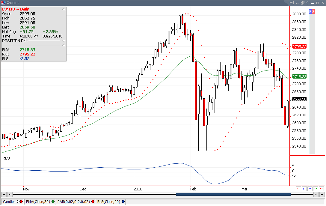
Other actions available on this frame: - left mouse click on the Buy/Sell bar will place an order at the price corresponding; - mouse scroll over the values scale will zoom in or out the values; - mouse scroll over the time scale will zoom in or out the time values; - navigate through the chart by pressing the arrow keys on the keyboard; - browse the chart by keeping the left mouse button pressed and moving up and down over the values scale. |
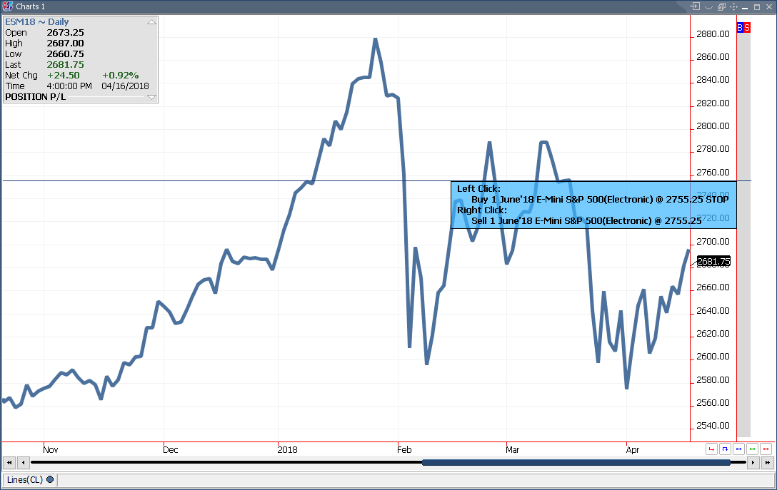 |
From the chart, you can flatten the contract at the market price, cancel the buy or sell orders for the contract or cancel all the orders for the contract . The buttons are in the lower right part of the frame.

|
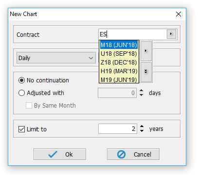
If you start typing the symbol of a contract, the "New chart" dialog appears and you can choose a different contract. After this, you have three type of chart settings. The first (the type of the chart) depends on the last (the limit to control). There are seven chart types: Daily, Weekly, Monthly, Quarterly, Intraday, Ticks and Volume. Each of this chart types have different limits which the user can set using the "Limit to" control below.
 |
In this module there are four types of data representation (data views):
|
- line - area - bars - candles |
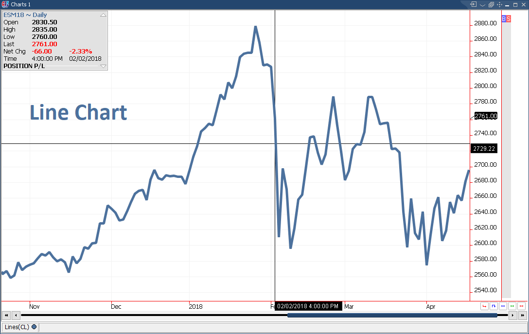
A line chart is the simplest chart type. It's created by drawing lines from one price to another during a time period. The prices used for the line chart are: close, low, high and open. By default the price used is close. You can change it from Lines Properties dialog. To open this dialog use double click on the status bar, "Lines section".
 |

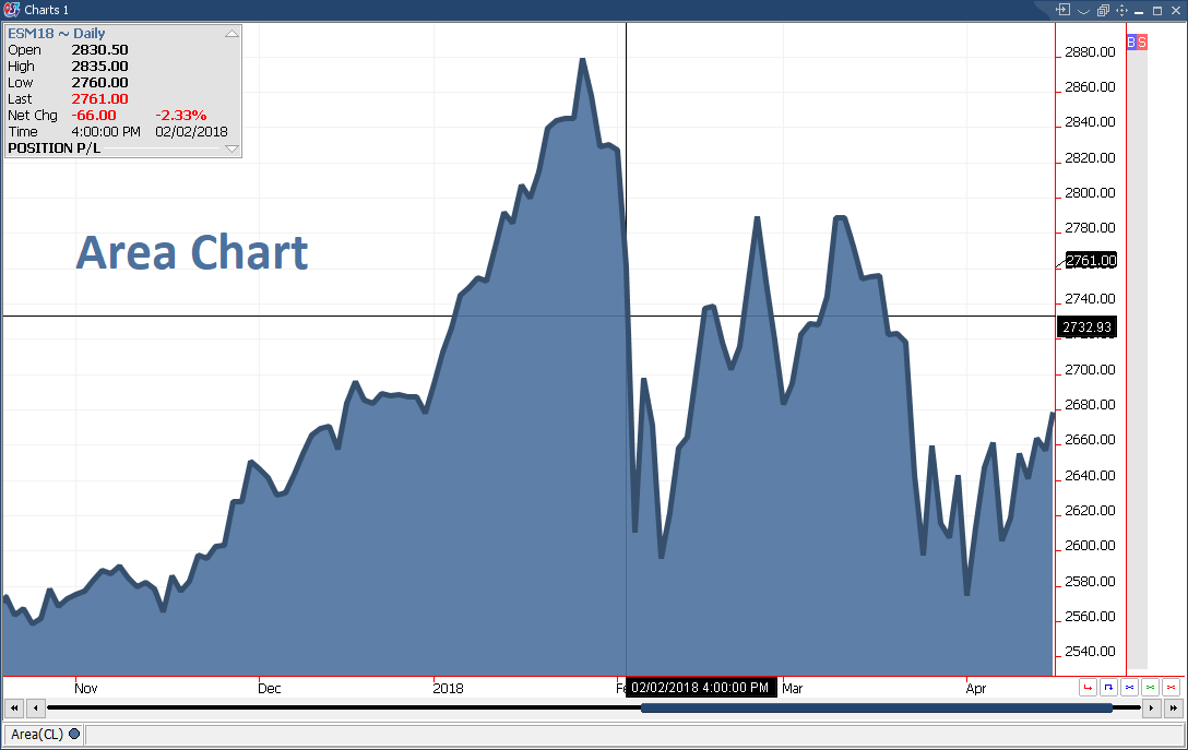
Area chart is similar with line chart. The difference is that the area chart is filled. The prices used for the area chart are: close, low, high and open. By default the price used is close. You can change it from Area Properties dialog. To open this dialog use double click on the status bar, "Area section".
 |
A bar chart shows more data then a line chart. The open, high, low and close price for a chart point are shown simultaneously on a bar chart.
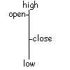 |
When a chart point is created, the first line that is drawn is the open price. Subsequent price movement will produce the high and the low price for the chart point. The final price for the chart point is close price.
When you click the left mouse button, the bar at the same timestamp with the mouse pointer will be highlighted like in the example below. The same feature is available with the candles chart.
By default the size of a bar is small. You can change it from Bars Properties dialog. To open this dialog use double click on the status bar, "Bars section".
By a right click on a bar you can report it "bad bar" or you can edit it. "Bad bar" option send a warning for the server if the user considers that the bar represents wrong dates. To see more about these features, click here.
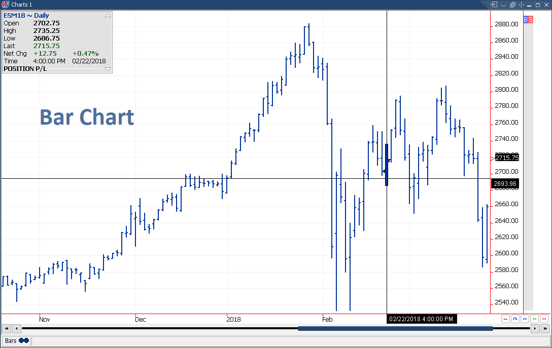 |
A candle chart shows the same information as a bar chart: open, low, high and close price. In plus, the change in price is more evident on this type of chart because the difference between the open and close is shown in a graphical way. In the following example, the O<C color is white and the O>C color is red. The color of candles can be changed from the Candles Properties dialog. It can be opened by double-clicking on the status bar, "Candles section".
By a right click on a candle you can report it "bad bar" or you can edit it. "Bad bar" option send a warning for the server if the user considers that the candle represents wrong dates. To see more about these features, click here.
 |